CMYK Screen Print
University Of Minnesota Landscape Arburetum
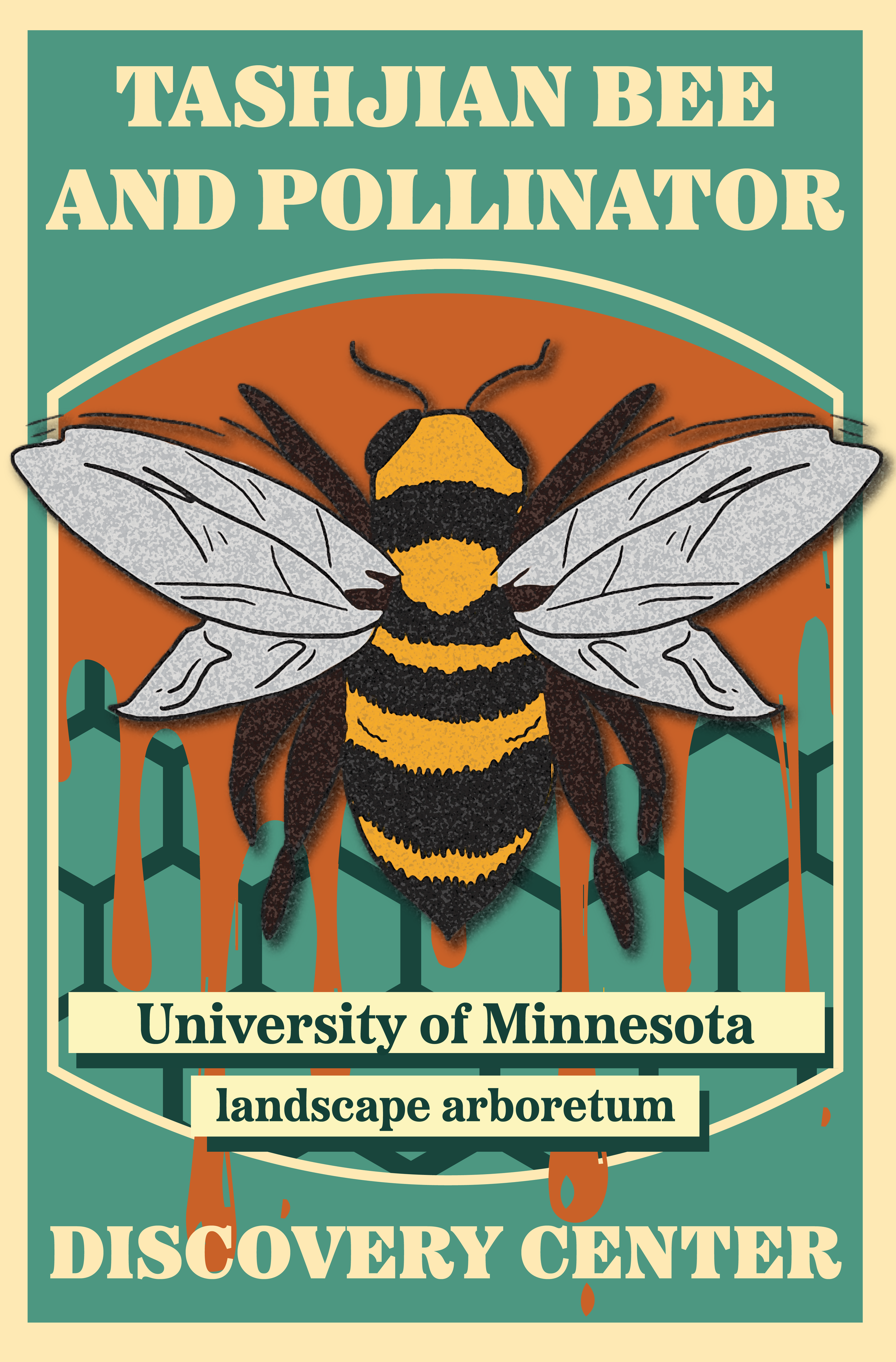
The purpose of this project was to design and screen print a poster for the University Of Minnesota Arburetum. I chose to design for the Tashjian Bee and Pollinator Discovery Center. After creating my design in illustrator I learned the process of CMYK printing on papper.
Adobe Illustrator
Screen Print


Brand Statement:
This project was all about combining design with environmental awareness—using CMYK screen printing to create a poster for the University of Minnesota Bee Sanctuary. The goal was to make something that wasn’t just visually interesting but also meaningful, highlighting the importance of pollinators and their role in the ecosystem. By using screen printing, I was able to explore the more hands-on side of graphic design while also making something tangible that could be shared and distributed.
Target Audience:
The poster was designed for people visiting the University of Minnesota Landscape Arboretum—students, researchers, and anyone interested in conservation. I wanted to create something that would stand out and grab attention but still feel connected to the natural setting. Whether someone already cares about pollinators or just happens to see the poster and get curious, the goal was to make something that sparks interest and appreciation.
Process:
This project involved a mix of research, design, and hands-on printing:
Research & Concept Development: I looked into pollinators, their impact on the environment, and different ways they’ve been represented in design.
Designing for CMYK Separation: Since screen printing requires separating the design into cyan, magenta, yellow, and black layers, I had to make sure the composition worked in a way that would translate well when printed.
Printing & Production: This was the biggest challenge, coating and exposing screens, getting the registration right, and making sure each print had solid ink coverage while keeping everything aligned.
The Outcome:
In the end, the project was a great way to combine graphic design with a cause I care about. The posters turned out bold and engaging, and the process of printing them was just as rewarding as designing them. They serve as both a design piece and a way to bring attention to the Bee Sanctuary’s mission. This project reinforced how print design, especially something as hands-on as screen printing, can still be a powerful way to share ideas and connect with people.